ITC Oldbook™
方正字体说明
ITC Oldbook™.TTF
字体英文名称:IT362___.TTF
ITC Oldbook™
品牌:ITC(Monotype)
设计师:
Berranger,Éric de
发行时间:2018
字库编码:
Unicode
分类:
衬线体
字体属性:
字体介绍
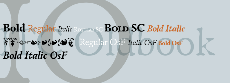
一段时间以来,Eric de Berranger一直想要创作一种仿古的字体设计——一种看起来像古董印刷并显示出磨损迹象,但仍然具有很高的可读性的字体。正忙着设计一种叫做Maxime的新字体,他突然有了一个想法:我意识到我可以将这些字母形状用于创作我古老的字体的依据。”他说。这两个字体最终被同时设计。虽然ITC Oldbook清晰地捕捉到了年代久远、不均匀和不完美的印刷风格,但它也符合de Berranger的目标,即在文本大小方面具有极高的可读性。关键是从精心绘制的字符开始,然后并将这些模型仔细地塑造成仿古的形式。“这个过程比我原先想象的要困难得多,”de Berranger说,“这些古老的字母必须经过多次测试和修改才能正常工作。” ITC Oldbook在文本和显示尺寸上优雅地模拟了古老的印刷风格。虽然笔画的粗细不均匀,曲线也不规则,但在文本块中设置时,颜色却非常均匀。再加上设计固有的易读性,ITC Oldbook所获得的范围远远超出了对旧事物的复制;它很适合任何需要温度及饱经风霜的排印项目。ITC Oldbook提供Roman和Bold两种字重及其相应的斜体设计。小型大写字母、老式数字以及一家族替代字符和装饰字符为设计提供了额外的灵活性和个性。”<br><br>
For some time, Eric de Berranger had wanted to create a distressed typeface design - one that gave the appearance of antique printing and showed signs of wear, yet was still highly readable. He was busy designing a new face called Maxime, when an idea struck: I realized that I could use these lettershapes as the basis for my antique typeface," he says. The two faces ended up being designed in tandem. While ITC Oldbook clearly captures the flavor of aged, uneven and imperfect printing, it also meets de Berranger's goal of being exceptionally readable in text sizes. Beginning with well-drawn characters was the key, and these were carefully modeled into the distressed forms. "The process was more difficult than I originally thought," says de Berranger. "The antique letters had to be tested and modified several times to work correctly." ITC Oldbook elegantly simulates antique printing in both text and display sizes. And while stroke weights are uneven and curves are irregular, the design has remarkably even color when set in blocks of text copy. Add to this the design's inherent legibility, and ITC Oldbook acquires a range far beyond replication of things old; it's suitable for any project that calls for warm and weathered typography. ITC Oldbook is available in roman and bold weights with complementary italic designs. Small caps, old style figures and a suite of alternate characters and ornaments provide additional flexibility and personality to the design."
书法字体下载地址
特别提示
1、本站所有资源仅供学习与参考,请勿用于商业用途,否则产生的一切后果由您自己承担!
2、如有侵犯您的版权,请及时联系,请来信978767986#qq.com(请将#换成@发送邮件),我们将尽快处理。


