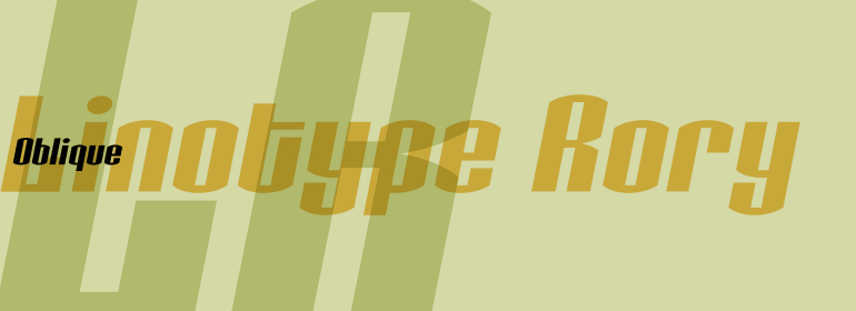
Linotype Typo American™
方正字体说明
Linotype Typo American™.TTF
字体英文名称:TypoAmericanCom.TTF
Linotype Typo American™
品牌:Linotype(Monotype)
设计师:
Stanczyk,Mark
发行时间:2018
字库编码:
Unicode
分类:
字体属性:
字体介绍
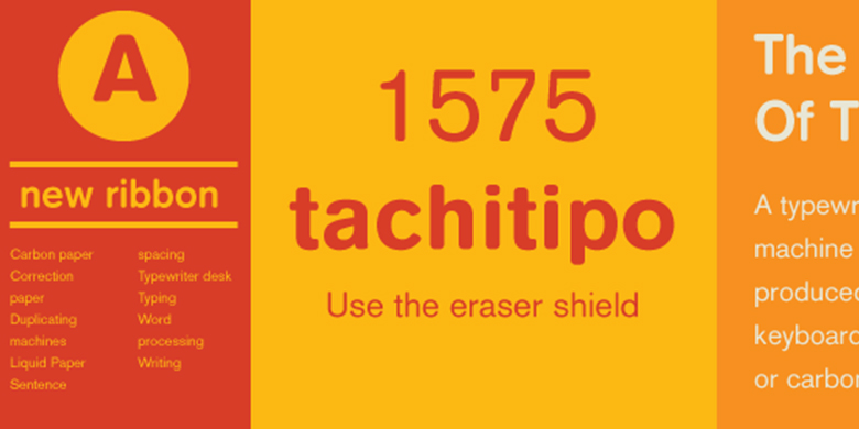
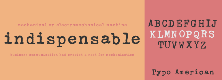
1999年,Mark Stanczyk设计了字体Linotype Typo American。该字体是对美式打字机字体的完美复刻。正如我们大多数人对于童年时代的记忆或者通过古老的故事和电影所记得的那样,每个人在计算机发明之前都曾经使用过打字机。与计算机不同,大多数个人打字机只有一种字形或字体可供选择。更糟糕的是,打字机中的字母会随着使用而磨损。随着时间的流逝,在打字机上打出来的文本看起来越来越腐蚀、陈旧且不均匀。Stanczyk在这款复刻的字体中彻底捕捉到了这些特征!<BR>
与大多数老式打字机一样,Linotype Typo American的字母都是等宽的,即字母i与字母w的宽度相同。打字机字母也都倾向于使用相同的大小-大约12pt左右。使用打字机风格的字体时,最好保持文本大小一致(当然,您也可以使用Linotype Typo American设置非常大的、有趣的标题;如果有什么不同的话,那便是设计的不均匀性会在这些应用中表现得更加明显。<BR><BR>
Mark Stanczyk designed Linotype Typo American in 1999. The font is an excellent revival of American style typewriter type. As most of us can remember from our childhood years, or through old stories and movies, everyone used to type with typewriters before the invention of computers. Unlike computers, most individual typewriters only had one typestyle, or font, to chose from. To make matters worse, the letters in a typewriter font would wear down with use. Over time, text typed out on a typewriter would look more and more corroded, old, and uneven. Stanczyk has captured exactly these features in this revival" font!
Also like most older typewriter styles, Linotype Typo American's letters are all mono-spaced, i.e., the letter i is the same width as the letter w. Typewriter letters also all tended to be cast in the same size - around 12 points or so. When using typewriter-style fonts, it is best to keep setting your text in similar sizes (of course, you can set really large and fun headlines with Linotype Typo American, too; if anything the unevenness of the design will come even more across in these applications)."
书法字体下载地址
特别提示
1、本站所有资源仅供学习与参考,请勿用于商业用途,否则产生的一切后果由您自己承担!
2、如有侵犯您的版权,请及时联系,请来信978767986#qq.com(请将#换成@发送邮件),我们将尽快处理。

