Astrotype™
方正字体说明
Astrotype™.TTF
字体英文名称:zhuan_AstrotypeNLTStd-Dot.TTF
Astrotype™
品牌:Linotype(Monotype)
设计师:
Hild,Andreas
发行时间:2019
字库编码:
Unicode
分类:
符号
字体属性:
字体介绍
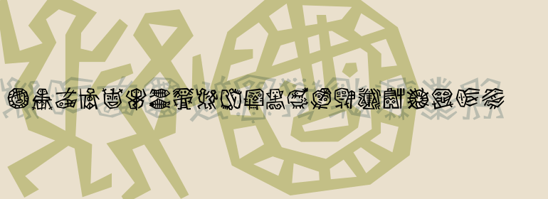
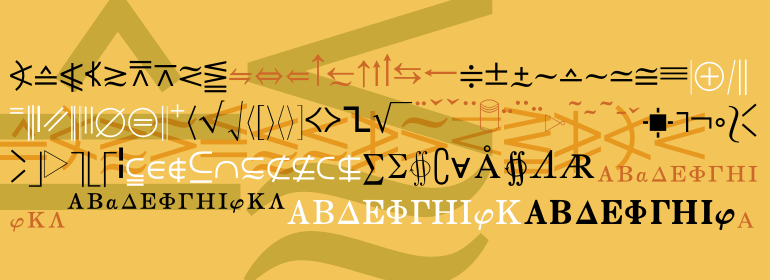
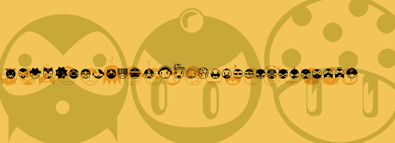
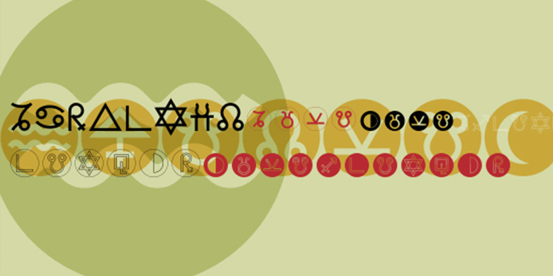
在2001年从事艺术装置FESTO HARMONICES MUNDI / Astrolabium的工作时,德国设计师Andreas Hild对缺乏好的天文/天文字体感到沮丧。在发现所有可用字体都不符合他的需求后,他开始了Astrotype符号字体家族的开发。他的努力所产生的大量成果也可能正是您要寻找的字体。 <br><br> Astrotype有六种不同样式。天体N点包含单线占星术符号,它们被填充的圆圈删除了。 Astrotype N Dot轮廓描绘了相似的符号,并增加了轮廓。 Astrotype P是该家族中最简单的字体,它仅包含占星术符号,作为类似文本的字形,没有任何边界。这些角色非常有趣。它们看起来像字母表中的其他字母! Astrotype P Outline用轮廓形式描绘了这些相同的符号。 Astrotype P点和Astrotype P点轮廓将这些符号放置在未填充的圆圈中。 Astrotype家族的独特性源于其清晰,同质和纯净的形式。基于相同的元素,全部以一致的比例绘制,这些字形展现出自然的优雅与和谐。这些字体值得关注,因为它们可以轻松地集成到周围的文本中,并且可以通过组合不同的粗细来确保多种创意。例如:尝试将Astrotype N Dot放在Astrotype P Dot上并使用不同的颜色-立即可以为屏幕上的按钮,图标和装饰品创建完美的组合。 <br><br>
天文是在天文或占星书,期刊,杂志或其他文学中使用的绝佳选择。它既可以在文本中也可以在随附的图形中有效使用。使用所有的权重还开辟了许多说明性的可能性,即海报和塔罗牌。
Linotype GmbH的Take Type 5家族包括整个Astrotype家族。”<br><br>
While working on the art installation FESTO HARMONICES MUNDI/Astrolabium in 2001, German designer Andreas Hild become frustrated by the lack of good astronomical/astrological fonts. After discovering that none of the available fonts suited his needs, he began the development of the Astrotype symbol font family. The extensive work that resulted from his efforts may be exactly the font you are looking for, too. <br><br>
Astrotype is available in six different styles. Astrotype N Dot contains mono-line astrological symbols knocked-out of filled-in circles. Astrotype N Dot Outline depicts similar symbols, with added outlines. Astrotype P, the simplest font of the family, contains astrological symbols alone as text-like glyphs, without any borders. These characters are very intriguing; they look like additional letters of the alphabet! Astrotype P Outline depicts these same symbols in outline form. Astrotype P Dot and Astrotype P Dot Outline take these symbols, and place them in unfilled circles. <br><br>
The Astrotype family's unique character stems from its clarity, homogeneity and pure form. Based on the same elements, all drawn with consistent proportions, the glyphs display a natural elegance and harmony. These fonts merit notice because of the ease with which they may be integrated into surrounding text, and the many creative possibilities that ensure from the combinations of different weights. For example: try placing Astrotype N Dot over Astrotype P Dot and using different colors - immediately you can create the perfect combinations for onscreen buttons, icons, and ornaments. <br><br>
Astrotype is an excellent choice for use in astronomical or astrological books, journals, magazines, or other literature. It may be used effectively both within the text and in accompanying graphics. Using all weights also opens up a number of illustrative possibilities, i.e., posters and tarot cards.
The entire Astrotype family is included in the Take Type 5 collection from Linotype GmbH."
书法字体下载地址
特别提示
1、本站所有资源仅供学习与参考,请勿用于商业用途,否则产生的一切后果由您自己承担!
2、如有侵犯您的版权,请及时联系,请来信978767986#qq.com(请将#换成@发送邮件),我们将尽快处理。

