ITC Medea™
方正字体说明
ITC Medea™.TTF
字体英文名称:IT334___.TTF

ITC Medea™
品牌:ITC(Monotype)
设计师:
Napoleone,Silvio
发行时间:2018
字库编码:
Unicode
分类:
无衬线体
字体属性:
字体介绍
ITC Medea的设计师Silvio Napoleone说:“我一直对早期的字母形状感兴趣,尤其是它们对现代印刷设计的影响。当我在希腊度假时,我有机会亲眼目睹了早期字母和排印的实例。他们确实给我留下了深刻的印象。将古代与现代结合起来以创造新事物的想法是ITC美狄亚的主要灵感来源。
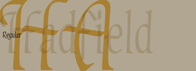
ITC Medea本质上是现代无衬线字体与优雅的uncial字体的完美结合。乍一看,Medea似乎是由几何形状构成的。但是,仔细观察会发现许多书法上的精妙之处。有些字符的笔画末端是微微张开的,比如'e'和'c'。“d”的顶部曲线比底部更明显,像“o”这样的字符是椭圆形的,而不是圆形的。 “我着迷于uncial和half-uncial的简单性和易读性。” Napoleone回忆道,“我以为它会是一款精美的标题字体,令我惊讶的是ITC Medea在正文中看起来是那么吸引人。” <br><br>
BRNapoleone的设计过程始于手绘图。他回忆说:“我在随手可得的地方画草图,通常是用笔在一些废纸上画。” 一旦他对一种可能的设计感到满意,他就会在电脑上创建基本的字符,进行精炼,然后作为轮廓导入到Fontographer中,Napoleone用这一软件来测试和完善字体。<br><br>
BRNapoleone目前居住在多伦多,为一家“年轻、热情的interactive公司”工作,他的设计已在国内和国际上展出,他的作品也是American Institute of Graphic Arts)巡回展览的一部分。<br><br>
The designer of ITC Medea , Silvio Napoleone said: “I've always had an interest in early letter shapes, particularly how they influenced modern typographic designs. While I was on vacation in Greece, I had a chance to see, first-hand, examples of early letterforms and typography. They really made an impression on me.” The idea of combining the ancient and the modern to create something new was the primary inspiration behind ITC Medea.
<br><br>
ITC Medea is essentially a careful blending of the modern sans serif with the elegant forms of the uncial. At first glance, Medea appears to be constructed of geometric shapes. However, closer inspection reveals many calligraphic subtleties. Stroke terminals are flared slightly in characters like the 'e' and 'c.' The top curve of the 'd' is more pronounced than the bottom, and characters like the 'o' are elliptical rather than round. “I gravitated towards the simplicity and legibility of the uncial and half-uncial,” Napoleone recalls. “I thought it would make a great titling font, and I was surprised at how attractive ITC Medea looked in a body text.”
<br><br>
Napoleone's design process started with hand drawings. “I sketched on whatever was handy, usually with a pen on some scrap paper,” he recalls. Once he was comfortable with a potential design, base characters were created on the computer, refined, and then imported as outlines into Fontographer, which Napoleone used to test and complete the font.
<br><br>
Napoleone currently lives in Toronto, where he works for a “young, enthusiastic interactive firm.” His designs have been exhibited nationally and internationally, and his work was also part of a traveling exhibit for the American Institute of Graphic Arts.
书法字体下载地址
特别提示
1、本站所有资源仅供学习与参考,请勿用于商业用途,否则产生的一切后果由您自己承担!
2、如有侵犯您的版权,请及时联系,请来信978767986#qq.com(请将#换成@发送邮件),我们将尽快处理。

